ClockfaceSmile - Smile Clockface
A teal field over a black lower half, with the clock on the teal and three metric columns below the fold.
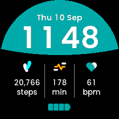
Smile in the app simulator. The step count and active minutes are the design’s sample values, fed in by hand: the simulator cannot serve the daily sensors, so both read zero when you run it yourself.
New to faces? Start with Writing a Watch Face, which covers the structure, the platform constraints and the techniques all five faces share. This page is only what is particular to Smile.
Directory |
|
|
|
|
|
|
~145 KB, of which the background bitmap is ~58 KB |
Design |
Figma |
Fonts |
|
What it demonstrates
A bitmap background from a clipped shape
The design builds the teal field from one large ellipse clipped to the round face, and the ellipse’s lower edge is what makes the “smile”. Both come out of the Figma export:
clip: the 240 disc, centre (120, 120), radius 120
ellipse: centre (120, -59.89), radii (317.63, 170.77),
#008080
which puts the boundary at y = 111 in the middle and y = 104 at the sides – verified against the design render at x = 30, 120 and 210. It ships as one bitmap because it never changes, it is one blit, and TouchGFX has no ellipse-segment primitive anyway.
It is drawn with no antialiasing, deliberately. This is the worked example of the four-levels-per-channel constraint in the guide: between the teal and black there is exactly one representable tone, so a blended edge cannot ramp – every partially covered pixel lands on it, and on this shallow curve that read as a dark dashed line. Hard edges quantise to exactly the two colours the design uses. The asset contains two colours and no others, which is the property to preserve if it is ever redrawn.
Columns that need no layout
Each column is a value over its unit, both centred in a fixed box on the
column’s centre – 55, 120 and 185.5, where the design centres them and where
the icons sit. So a value that changes width re-centres itself and setHealth()
only writes buffers and invalidates. The units are static Text IDs (steps,
min, bpm) rather than part of a <> min template, because the design puts
them on their own line.
Only the clock is measured and centred at runtime (kSeparator12 = 24,
kSeparator24 = 5).
Assets
Background_240x240.png (generated from the geometry above), plus
StepsIcon_17x23.png, ActivityIcon_27x17.png and HrIcon_22x19.png from the
content pack.
The design also carries two hairline rims at the very edge of the disc, one black and one teal, each about two pixels wide. They are not reproduced: at every point each sits on ground of its own colour, so they are invisible, and reproducing them would mean another full-screen layer.
Known gaps
Two of the three columns cannot be fed by the simulator (see the guide).
The launcher icons are placeholders.